Sculpture Colors - Color Selection in Statue
Sculpture, as a three-dimensional art form, is not merely about shape and volume. Color is perhaps one of the most decisive elements in the impression a sculpture leaves on its viewer. A well-chosen color can reinforce the soul of a work; a poorly applied tone can erase all the power of the form. For this reason, sculptors must take the matter of color seriously immediately after selecting their material during the production process.
The use of color in sculpture has a deep-rooted tradition stretching from antiquity to the present day. Archaeological findings have now confirmed that ancient Greek sculptures were actually painted, with marble surfaces covered in vivid pigments. In other words, the perception of the "white marble sculpture" is a historical misconception. Color has been intrinsic to the nature of sculpture from the very beginning.
Key Reasons Behind Color Selection
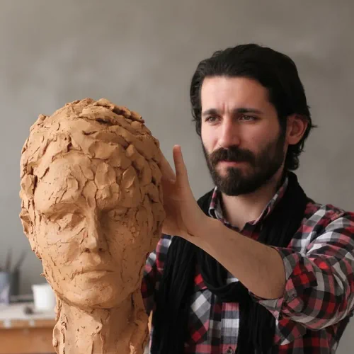
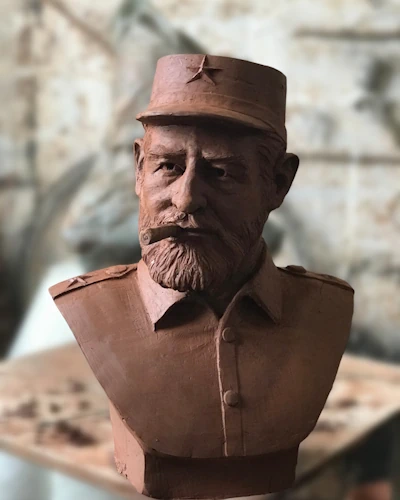
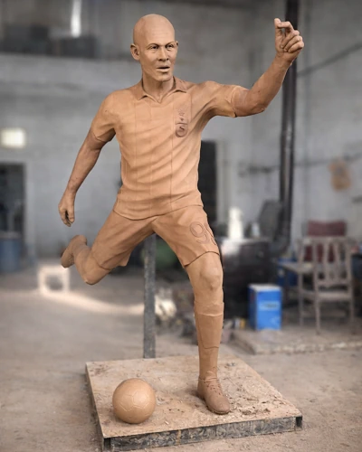
Color selection in a sculpture is not a random preference. There are several fundamental factors that determine this choice. Chief among them is the inherent nature of the material. Every material — bronze, stone, wood, ceramic, or resin — carries, reflects, and absorbs color differently. The porosity, surface texture, and light permeability of the material directly affect the final appearance of the color.
Beyond that, the thematic content of the work also guides color selection. A sculpture depicting war and suffering does not carry the same color palette as a form centered on nature and life. Color is a linguistic element that visually supports what the sculpture is saying. The artist's conscious construction of this language ensures the coherence of the work.
Color Application According to Material
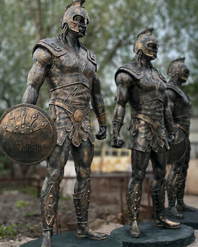
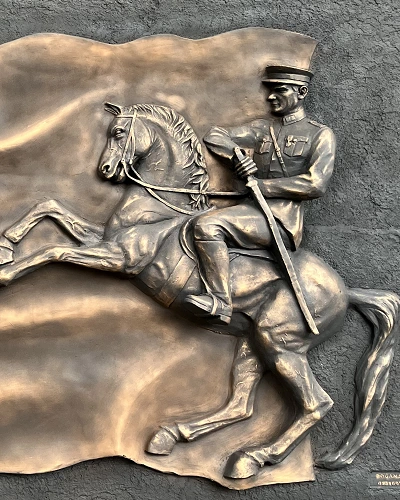
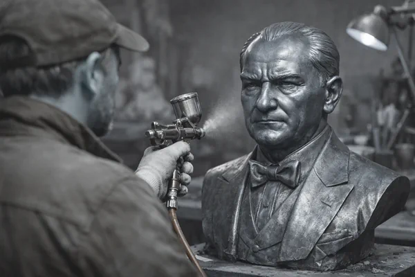
In bronze sculptures, color is largely obtained through chemical oxidation known as patina. Various acid solutions, heat, and humidity combinations applied to the bronze surface create a natural layer of color in green, brown, black, or blue tones. Patina serves both an aesthetic and a protective function. The artist can reach the desired depth of color by controlling this process; however, unpredictable organic outcomes are also part of the work.
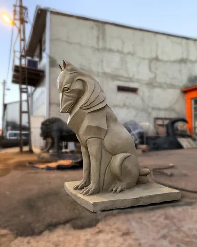
In stone sculptures, color generally comes from the essence of the material itself. Marble, granite, basalt, or limestone each carries its own distinctive tone. That said, some artists apply mineral-based paints or wood stains to stone surfaces to create different effects. This approach has become particularly widespread in contemporary sculpture.
Wood sculptures are among the most flexible materials in terms of color. When the grain and texture of wood combine with color, an extraordinarily organic and vibrant appearance emerges. Artists can apply acrylic, oil paint, varnish, or natural dye to wood. What matters is creating a layer of color that penetrates the grain of the wood, allowing the surface to breathe and producing an aging process that grows more beautiful over time.
Ceramic and plaster sculptures offer the widest range of possibilities in terms of color application. Glazes applied before firing can produce surprising results as their chemical structure changes during the firing process. In ceramics, color is a process where control and chance dance together.
The Role of Dark and Light Colors in Sculpture
Sculpture is an art that exists through light and shadow. For this reason, how dark and light colors are placed within a work directly determines how the form is read. When dark tones are applied to recessed and hollow areas, the sense of depth intensifies and the impression that the surface is drawing inward increases. When light tones are applied to protruding and forward-facing sections, the form leaps outward and the volume of the sculpture is felt in an exaggerated way.
This technique is the adaptation of the light-shadow logic used in traditional painting to three-dimensional material. Particularly in figurative sculptures, facial details, muscle structures, and folds of clothing can achieve a remarkably realistic appearance through this method. An artist who establishes a good balance between dark and light invites the viewer to walk around the sculpture. Because a different play of light emerges from every angle.
This principle holds true even in monochromatic color applications. Transitions achieved by using different shades of a single color lend the work both unity and a sense of movement. Particularly in bronze and stone sculptures, tonal transitions can be achieved naturally through patina and surface treatments.
Color Preferences According to Sculpture Type
Figurative sculptures — that is, works depicting the human or animal form — generally favor earth tones close to nature. Colors such as cream, light brown, gray, beige, and terra cotta support the realism of the form. In these sculptures, the aim is not for color to draw attention but to strengthen the form.
In abstract sculpture, color is used in a far freer manner. The artist may prefer strong, pure colors such as red, yellow, blue, or black to create a direct emotional impact on the viewer. In this type of sculpture, color carries as much meaning as the form itself. At times, color even supersedes shape.
Monumental and public sculptures generally favor colors that need to harmonize with their surroundings. In large-scale works placed within the urban fabric, gray, dark green, matte black, and bronze tones are common. This preference makes sense both in terms of durability and aesthetic compatibility. In the public sphere, sculpture must speak with its space; color is the most direct instrument of that dialogue.
Children's sculptures and cartoon character sculptures take the opposite approach. Vivid, saturated, and cheerful colors dominate these works. Yellow, orange, green, and blue increase children's curiosity and engagement. Here, color is functional — it makes the sculpture accessible and inviting.
Color Application Techniques
Color application in sculpture is not limited to painting. Natural color contrasts achieved by combining different materials also produce powerful results. For example, when polished stainless steel and matte black painted iron are used together, a striking contrast of color and texture emerges without any paint at all.
The most common of the painting techniques is acrylic application. Acrylic paints dry quickly, are water-based, and adhere well to surfaces. Because layered application is possible, it is possible to achieve effects with considerable depth. Oil paints, on the other hand, dry more slowly; this allows the colors to blend into one another, creating more organic transitions.
Patination, especially for metal sculptures, requires a distinct expertise. Unique surface colors are obtained by combining chemical solutions, flame application, and mechanical processes. This process demands both technical knowledge and patience. The outcome cannot always be fully predicted; this unpredictability is itself part of the artistic appeal of patina.
The Effect of Color on Artistic Texture
The texture of a sculpture's surface directly determines how color appears. Rough surfaces scatter light, making color appear more muted and deep. Smooth and glossy surfaces, by contrast, render color vivid and intense. For this reason, artists must also take surface texture into account when making color decisions.
Date Added: | Last Updated: